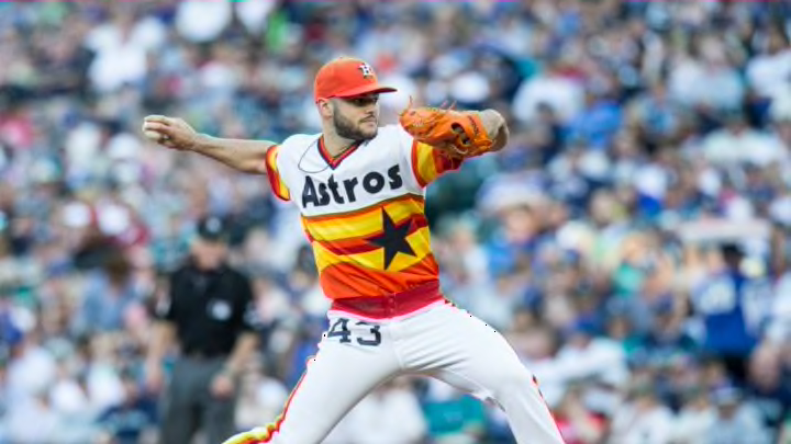
For decades, the evolution of how the Houston Astros rainbow uniform came about was a mystery but their peculiar story is finally told.
The rainbow uniform design has continued to be one of my favorite Houston Astros uniform design pieces and it’s right up there with the “Shooting Star” design of the 1960s. The design of the uniform that I mention of lasted for 21 years — from 1975-86 — and it has truly stood the test of time.
Paul Lukas of ESPN.com wrote a spectacular piece in regard to the untold story of the uniforms and how one begotten design firm created something that was revolutionary in its own right. Although I wasn’t alive when the unis debuted back in 1975, I do recall seeing them at games in the Astrodome before they were modified after the 1986 season, one of the best in team history.
Seeing greats like Nolan Ryan and guys like Mike Scott, Alan Ashby, Jim Deshaies and Billy Hatcher don those uniforms was nothing short of amazing.
I didn’t get to go to many games in my early childhood as my family was growing at the time and all my parents resources were focused on keeping a roof over our head and plenty of food to eat. But there were many occasions where I got to go to games and I’d just be in awe of the luminosity of the unis as well as the effervescence of our home field, fresh off multi-million dollar renovation where whole interior appeared to be a giant rainbow.
I want to let you read the piece itself but Gary Rollins, the director of Astros TV and radio network, was more in favor of the traditional design like the Detroit Tigers and Los Angeles Dodgers but was steered more in the direction of something more bold. The network was hemorrhaging money at the time and were on the verge of declaring bankruptcy. But it was the “new look” that staved off such a notion and were a big hit.
Here’s a categorization of the evolution by uni expert Paul Lukas:
Fun fact: Back-jersey design of Astros' rainbow uni evolved over the years. Original 1975 version was clearly the best. pic.twitter.com/dcnaRtIgb7
— Paul Lukas (@UniWatch) June 26, 2017
I do disagree with Lukas in regard to the notion of the ’75 jerseys being the best. I’m just not a fan of the number being encapsulated in a circle but I’m more in favor of the final rehash that continued from 1977-86. Even former Astros president and general manager Tal Smith lobbied hard to get the circle removed.
There were also sorts of designs proposed from a white star on the front to a unique-looking “A” on the cap of the uniform as well as orange pants. Take a look of those pics None of those would’ve been a good idea because one needs the audacity of such a new concept but not the point of being too tacky. I think the Houston Astros found a perfect medium with the two, hence the design that many of us still wear to this day as a homage to a notable era in franchise history.
Next: Astros Vs. Rangers: A renewed battle for ultimate pride
It would’ve been an injustice had this story had not been told and I’m glad that a fellow journalist went out to seek the truth and to report it as fully as possible. That is, of course, one of the guiding principles in this business. Let’s hope this design continues to stand the test of time like it already has.
Go Astros.
